Alps/
Educational leaders need tools to evaluate student progress but according to Alps those tools should put the wellbeing and potential of every student at the centre of their methodology. The Alps approach helps all students, no matter their ability or background, to reach their full potential. Our aim was to put these noble values at the heart of their brand.
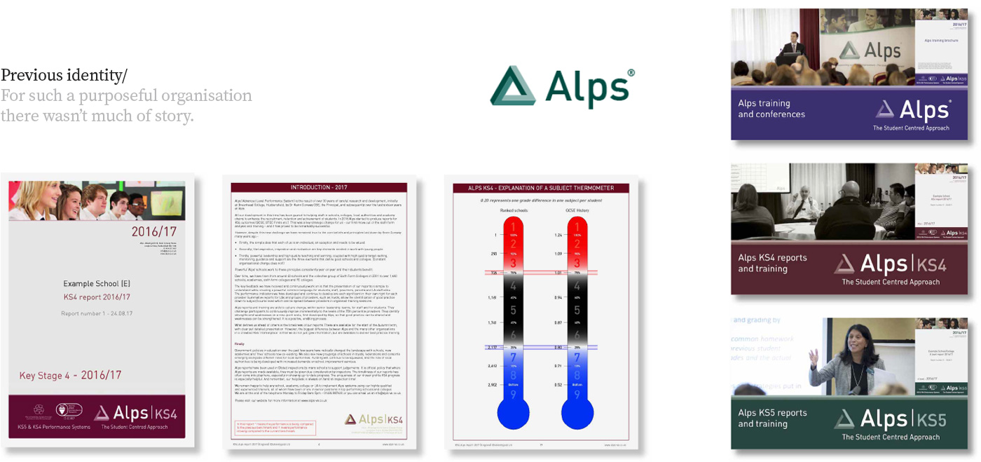
Where they were/
Alps offers data analysis tools to the education sector to guide both strategic and classroom level decision making. Their strong sense of purpose and values were not reflected in their brand communications. Most materials were complex, inconsistent and a little too academic in tone. They needed a stronger and clearer proposition to communicate their difference, an inspirational concept to appeal to like-minded teachers and educational leaders, with simplified messaging to convey what was often perceived as a complicated process.
Where we took them/
Most of Alps’ competitors focused on the data their tools could provide. Conversely the Alps philosophy genuinely stood-out as benefitting students. The Alps methodology was created by a visionary head-teacher who could see the life chances of many of his students being hampered by their lives outside school and the education system itself – he knew there must be a way to help his students achieve more.
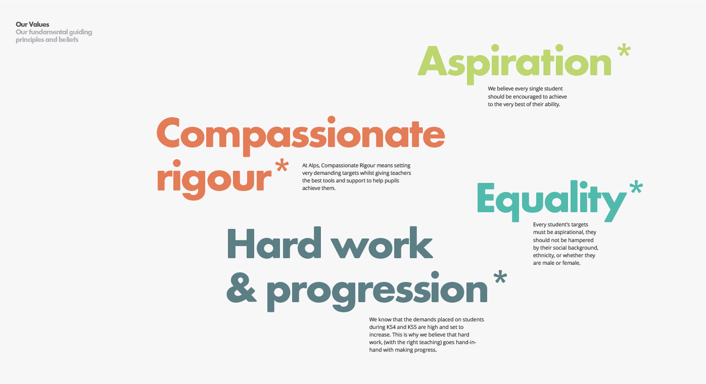
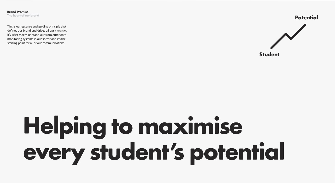
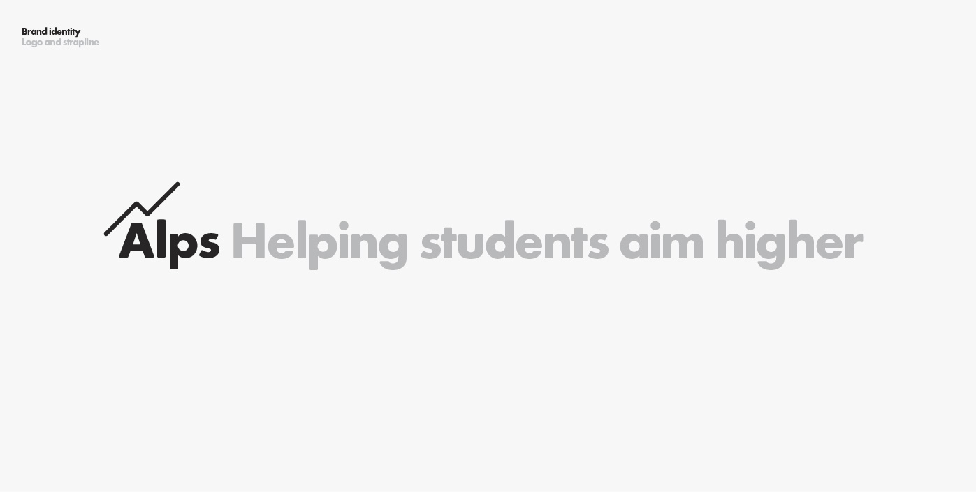
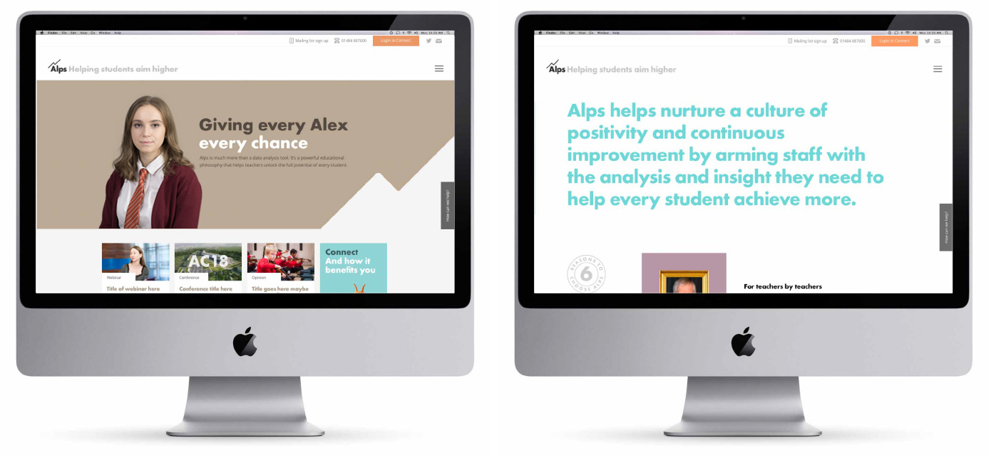
Alps’ data analysis tools were created by a teacher for teachers, so our brand proposition – ‘Helping you maximise every students potential’ was borne out of an insight from our research; that many teachers chose their career path to help improve the life chances of future generations. The brand values we collectively crafted struck a chord with the Alps team as being exactly what they stand for.
Creative Development/
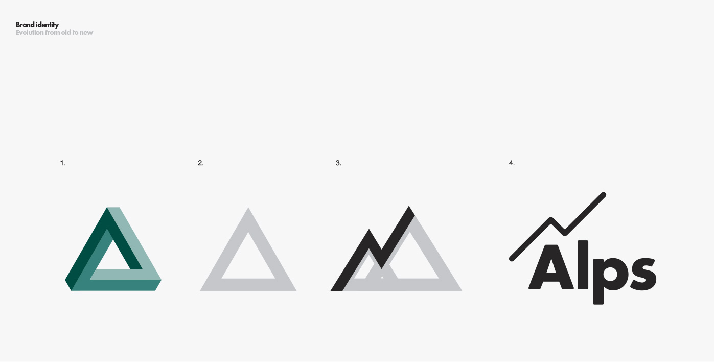
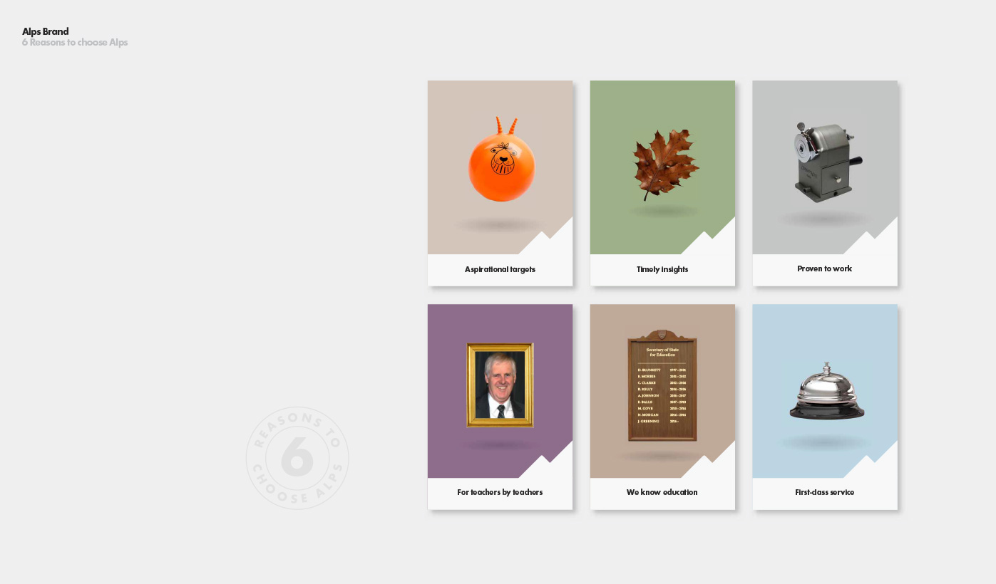
The new identity, including the new ‘Alps edge’ device, works on many levels; it depicts the non-linear path that progress often takes, it can represent the upward line on a graph and also the side of a mountain. The edge device works across all materials in various ways with striking effect.
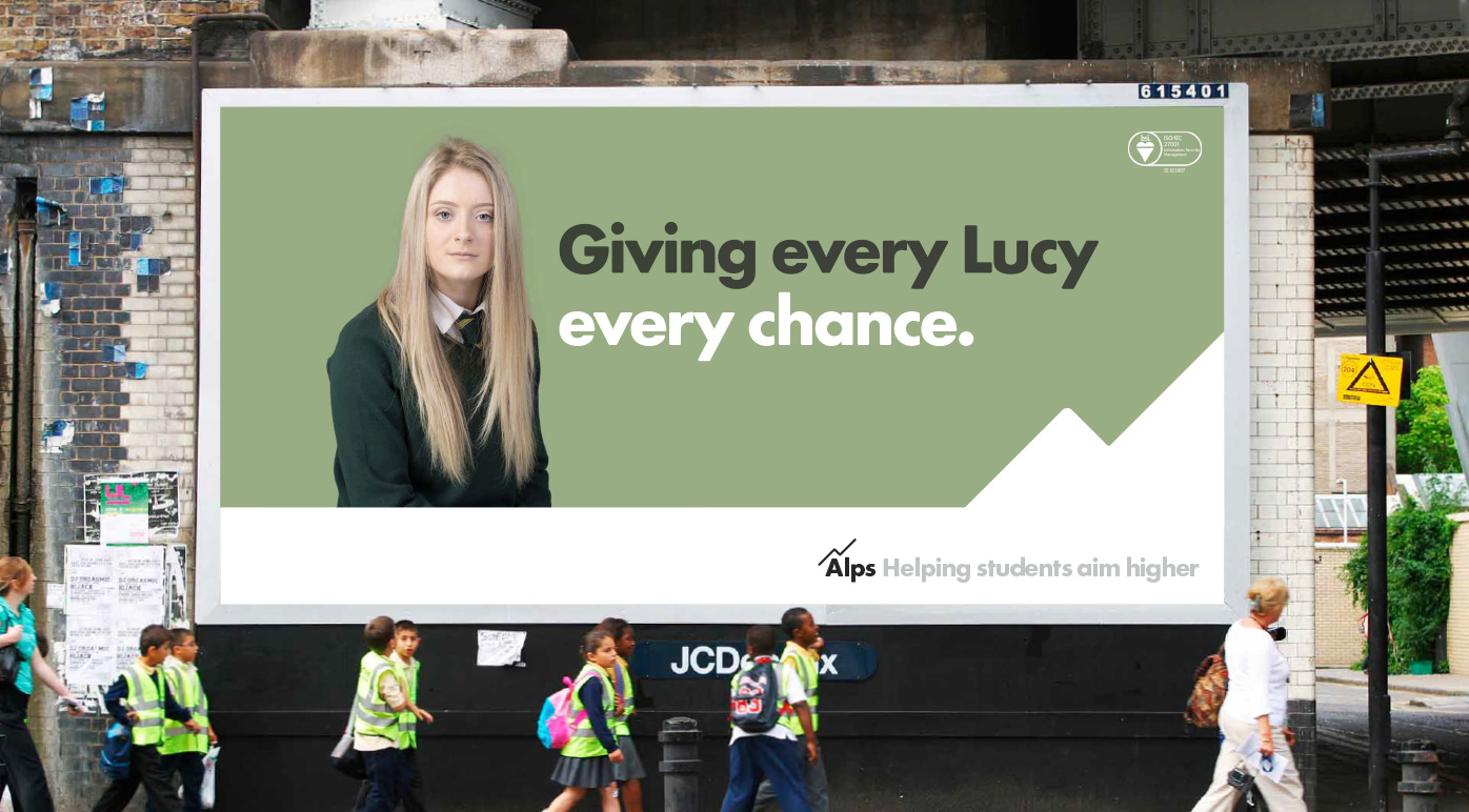
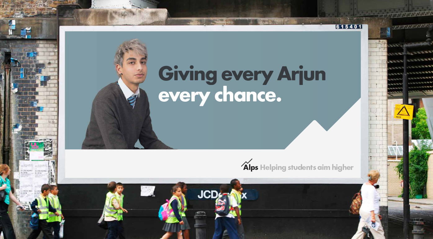
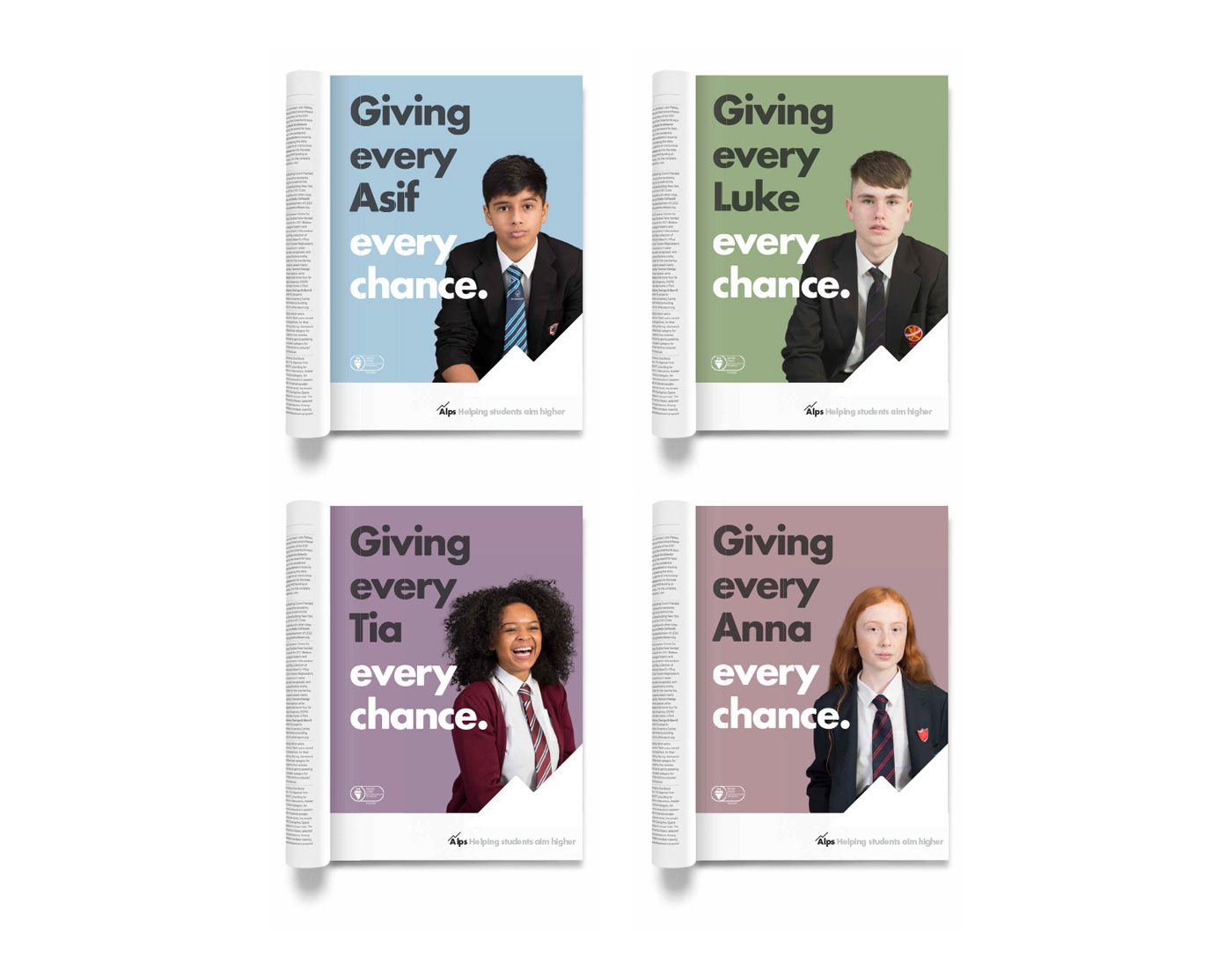
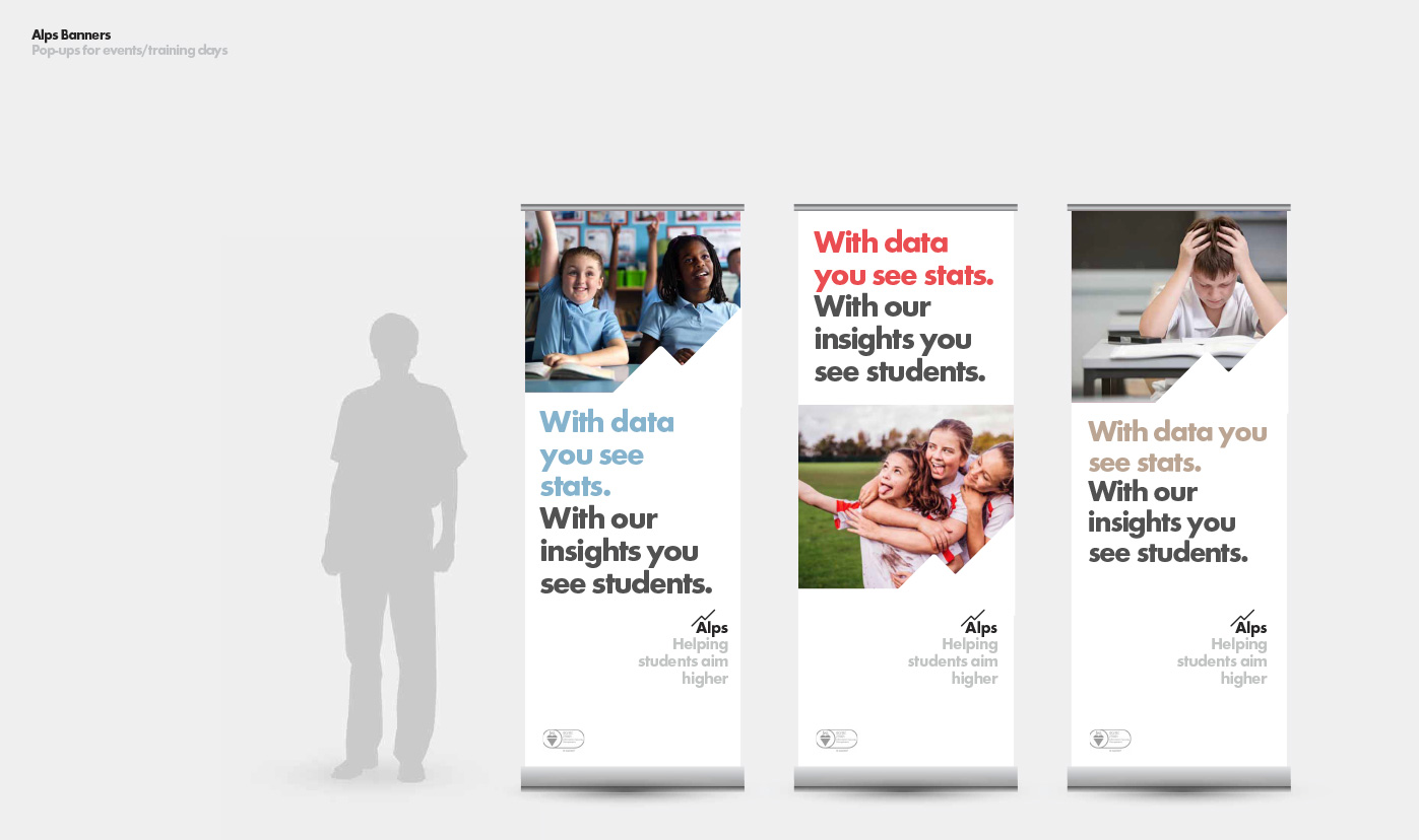
The headline ‘Giving every student every chance’ led our communications and was developed to include individual names such as ‘Giving every Tom every chance’. Our photography of individual student portraits was intentionally very real and emotive to stand out from the staged images depicting a rose-tinted view of student life, typical of the education sector. Our aim was to bring to life the fact that behind the data there are real people with real hopes for their future – it’s not the numbers that matter but the people behind them.
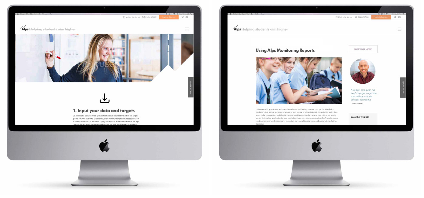
We created a website to inform, educate and inspire; a hub where teachers can go keep up to date on the latest in education and learn how Alps tools can be harnessed to help. It was important to position the Alps team as ‘thought-leaders’ in their sector and so we encouraged a well-maintained blog area with lots of different Alps contributors.
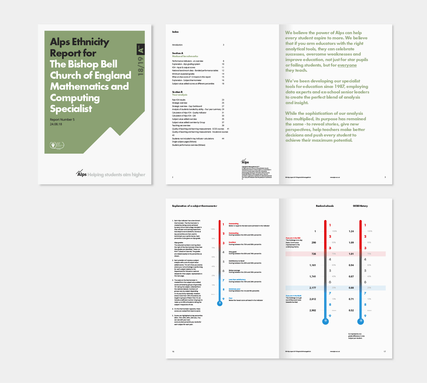
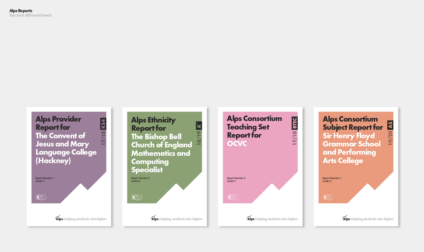
We created a template system for the Alps reports – a key part of their product. This provided the Alps team with an easy-to-use toolkit to create brilliant reports and provided clients with materials that were simpler to understand and easier to digest.